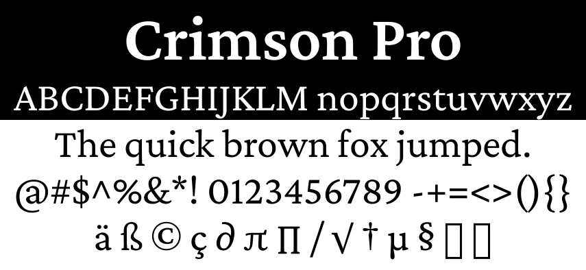
Crimson Pro
I've added a new serif font: Crimson Pro.
Contemporary, clear, classic and rounded/open. Something for a college textbook, editorial websites and any reading experience with book-length texts. It contributes to the tradition of beautiful Garamond-inspired typefaces.
The first Crimson design was initiated by Sebastian Kosch in 2009, and he later completely redrew a new version called Crimson Prime. Google commissioned Jacques Le Bailly to review both typefaces, and develop Crimson Pro as a new design that synthesises both designs into a final authoritative family, first released in January 2019. All decisions were made to enable better readability for longer texts and the ability to make good and diverse typography.

📅 2025-05-22
CC-BY-SA 4.0
The original Gemtext version of this page can be accessed with a Gemini client: gemini://skyjake.fi/fonts/news/2025-05_crimson-pro.gmi