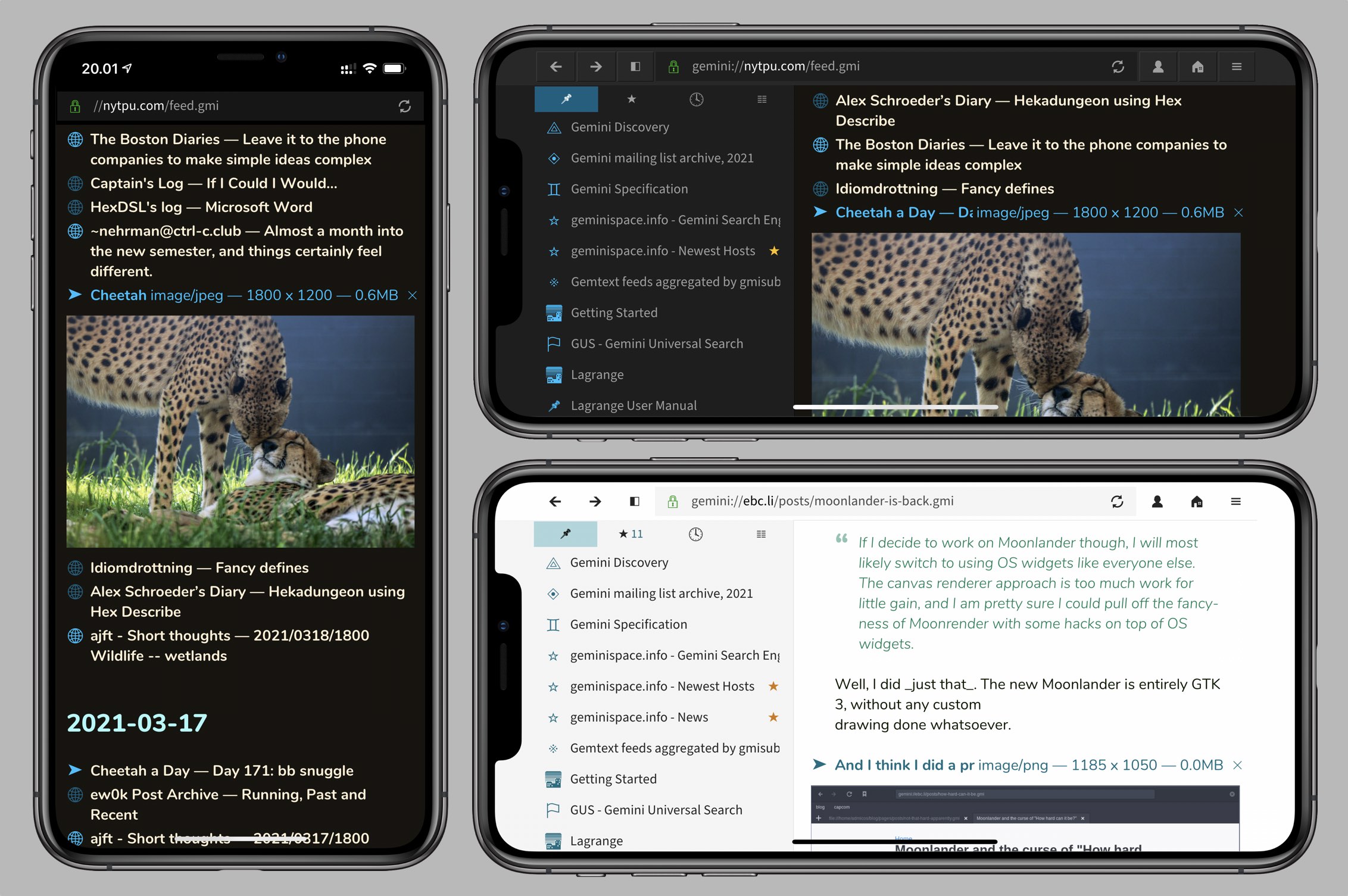
First ten days of Lagrange TestFlight
During the first ten days of the iOS TestFlight I've submitted five builds for public testing. A few crash reports have come in and some of the crashes have been fixed. Thanks a lot to the TestFlight participants for the feedback so far, it has been helpful.

Compared to last week's initial build, I've added a bunch of new features:
- Saving the current page to iCloud as a file.
- Experimental language translation service using LibreTranslate.
- Fading scrollbars.
- Cut/copy/paste context menu in input fields.
- Number of unread feed entries shown in Feeds tab header.
- Button for toggling the sidebar.
- "Find on page" menu item.
Status and outlook
With saving of pages now working there aren't any massive missing holes in the feature set. Perhaps the biggest question mark is the portrait phone UI. I can't quite make up my mind whether I want to continue with the slide-up panels or should it be switched to a more typical hierarchical layout like in Settings. The latter would make it natural to swipe back to return to the Feeds list, for example, when reading feed entries.
There are also too many menus currently, with the hamburger menu *and* context menus all over the place. On the desktop this is fine, but on a phone it would make sense to combine the page context menu and the hamburger menu, and move some of the app-level menu items under Settings or elsewhere, a bit more out of the way.
Optimization is a significant remaining work item, but I won't wade into that until I'm happy with the general design of the app. Media playback would also be nice to sort out using platform APIs, for more efficient decoding and wider codec support, and the ability to play audio in the background.
Upcoming 1.3
Many of the new features introduced in the TestFlight builds are available on the desktop as well. All the platforms will be updated in sync, so the TestFlight will roll over to 1.3.1, etc. until the app is solid enough on iOS.
I've made several changes to page appearance, with links shown in a bold font and color tweaks to many of the themes. Now when I look at 1.2, it feels quite dated and I actively choose to run 1.3 instead. Suppose that's a sign of progress?
Targeting all the platforms at once
In this project I've chosen the strategy of minimizing platform-specific code in the name of portability and reduced maintenance costs. It's been quite an interesting challenge to adapt the UI for mobile while sticking to a common set of UI widgets.
The danger here is introducing too many variations and conditional behavior, making it difficult to reason about what's going on. So far it's been manageable because the UI is not that complex. The most questionable area so far has been the restyling of the Preferences dialog. What you see on the phone are the same widgets as on the desktop, only partially reorganized into sliding sheets instead of a stack of tabs. In hindsight, it would make more sense to have a higher-level description of the settings and generate multiple widget representations out of it. That would also make it easier to fine-tune their appearance — the current approach starts descending into a pile of kludges that prevent reaching a satisfactory end result.
Many phone apps don't do much with landscape mode, but since Lagrange is not originally a mobile app it gets a full landscape mode for "free": it's basically just a downscaled version of what runs on a desktop. The more you get into phone UIs in the portrait mode, though, the more specialized adaptations are needed.
UI coding is one of my favorite pastimes, though, so I'm still having a lot of fun with this. I'm sure after a few iterations things will settle down and get a bit simpler, and more elegant.
📅 2021-03-21
CC-BY-SA 4.0
The original Gemtext version of this page can be accessed with a Gemini client: gemini://skyjake.fi/gemlog/2021-03_first-ten-days-of-lagrange-testflight.gmi