TestFlight Build 1.10 (1)
Thanks to a long weekend with the Finnish Independence Day falling on a Monday, followed by an extra vacation day, I decided to roll up my sleeves and make substantial improvements to the iOS version of Lagrange.
Text entry
It has become clear that implementing a text editor suitable for modern touch devices is not something that's doable by one person on their free time. Therefore, it was time to let the platform handle it: Lagrange now uses native iOS text fields wherever you enter text. This fixes what was by far the biggest showstopper in the iOS port thus far, and you get to enjoy all the fantastic features of native text input, including moving cursor via the spacebar, autocorrect, spell-checking, copy/paste, and share actions.
I was very pleasantly surprised how easily UIKit allows one to integrate native controls onto a custom UI. While a few minor issues remain with the integration, on first glance one may even miss that something has changed here. The native controls use the same font as the custom UI. However, I had to remove the UI font setting as only a predefined set of custom fonts is allowed in native controls.
Lagrange's mobile version is not intended to be iOS-specific, so the custom input widget that I've been working on remains as a fallback for other mobile platforms. I will probably keep working on it as a lower-priority item. When it comes to an Android build in the future, I may initially stick to the custom one but the circumstances are largely the same as on iOS: mobile devices just need a lot of sophistication for text input.
Phone sidebar, revision 3
Small devices require more significant adaptations in the UI to accommodate the characteristics of the device. I haven't been very happy with the design of the sidebar (Bookmarks, Feeds, History, Outline) on the phone. The second iteration of the sidebar made it a horizontally swipable panel but ultimately that didn't work out so well, plus its behavior was rather inconsistent with the rest of the main UI.
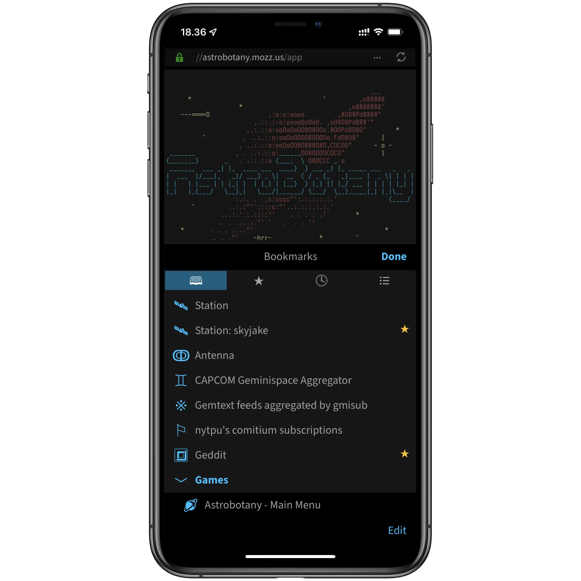
I decided to shamelessly copy what Safari is doing with its bookmarks: the sidebar is now a vertically swipable sheet that opens in a half-height position for good reachability with your thumb, and can be flicked up to full height, or down to dismiss. For good measure, I revamped the sidebar action buttons to fit the mobile UI, and implemented an edit/organization mode for bookmarks. All in all, I'm now very happy with how it feels to use the sidebar.

Identity management
Until now the app's identity management UI hasn't really had any mobile adaptations, and the functionality still remains largely the same as on the desktop. However, in this build, the Identities sidebar tab has been moved under Settings, and the Identity toolbar button provides a convenient way to stop using the current identity, create/import certificates, and switch between alternatives for the current site. The last feature is a great v1.10 addition, especially if you have multiple accounts on a site. Personally I use it for switching between my two Astrobotany accounts.
Under Settings, identity management is a tad removed from the main UI, so it may still require minor changes.
Pull to refresh
A staple of mobile UI design: you can now pull down on a page to refresh it. 🎉
(There's a bug, though: short pages are not scrollable at all. Will fix...)
Settings, widgets, UI tweaks
Options represented by button groups (radio/toggle) now have a different appearance, resembling lists of check boxes that iOS also uses in a number of places. All in all, Settings is looking a bit cleaner now, although not finalized by any stretch.
I've changed various parts of the UI to fit mobile better. For example, input prompts no longer look like the desktop ones, with action buttons moved to the top. The tablet UI has also been improved as it has been neglected a bit, thus far skating by as a slight twist to the desktop UI. One example is context menus that were using an over-the-top show/hide animation. Also, the bottom safe area inset required for the iOS home indicator is now accounted for on the iPad.
The full-screen presentation of dialog boxes is perhaps the biggest issue now. I may switch to smaller sheets for these, too.
App Store...?
While there's no telling how long this initial TestFlight period will continue, the ultimate goal is to make a public release in the App Store.
Text entry was a real showstopper so now there is at least some light at the end of the tunnel. Various parts of the app remain pretty rough, but it's more about polishing and optimization than fundamental changes at this point.
I've added iOS-specific Help and Release Notes pages so the ones from the desktop aren't shown any more. I've yet to write a mobile-focused Help document; it will be required for a public release.
📅 2021-12-07
CC-BY-SA 4.0
The original Gemtext version of this page can be accessed with a Gemini client: gemini://skyjake.fi/gemlog/2021-12_testflight-1.10.gmi