Lagrange v1.12: Export/Import, Bottom Bars, Visual Evolution
March was full steam ahead for Lagrange, and I ended up addressing a bunch of long-standing issues. The original idea of making page layout more flexible didn't really get worked on yet, apart from one new style option. However, many of the UI widgets underwent visual evolution.
Export/import user data
It has long been an issue that there is no way to sync the app's data between different devices. The new export/import feature in v1.12 aims to solve this by allowing one to manually export and import identities, bookmarks, browsing history, and site-specific information via a ZIP archive.
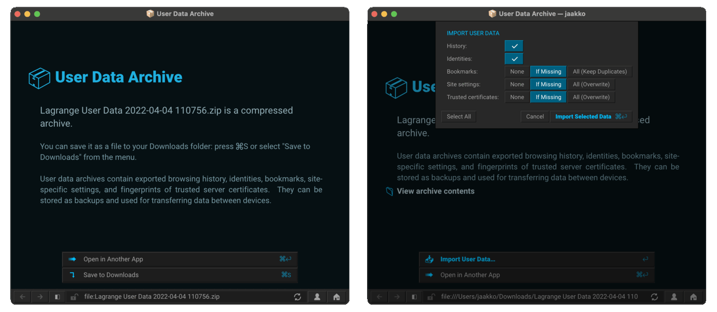
In practice, exporting user data creates a compressed archive that you can then transfer manually onto another device, or just put in a safe place for backup. Opening the exported archive works similar to fontpacks: when viewing the ZIP in the app, there is a button in the bottom of the window for importing. I decided to add fine-grained controls to choose which data gets imported and how, so you don't have to overwrite all the old data.
A noteworthy detail: browsing history also entails the read status of feed entries, since those are tracked based on whether entry URLs have been visited. So a transfer of user data essentially includes the up-to-date status of each subscription as well.
On the desktop, the UI is a little hamstrung by the lack of native file open/save dialogs, but it works well enough via the old "Save to Downloads" and drag-and-drop approach.
UI changes
Toward system fonts: Roboto, Segoe UI
Text is an integral part of the app's UI: even all the icons are just Unicode characters. Therefore, it's important to use the right fonts and the best text rendering APIs available. While I'm still using the same font rasterization library as before, the default fonts have again been changed with the intention of moving toward system UI appearance.
In practice, Roboto is now the default font on all platforms except Microsoft Windows, where Segoe UI (the long-time Windows UI font) is used. On macOS and iOS, Roboto is much less of a departure from SF UI compared to Source Sans, so it fits better with other apps and has a more modern feel overall. Android, of course, has been using Roboto for UI so it's a nice fit for the platform. Linux is more challenging because there is no single default font. UI toolkits generally have their own defaults that change over time, or distros may have specialized fonts like on Ubuntu. Roboto is generally neutral enough not to offend, but really fitting in would require consulting the native font configuration APIs/files. That is something to deal with in a future release.
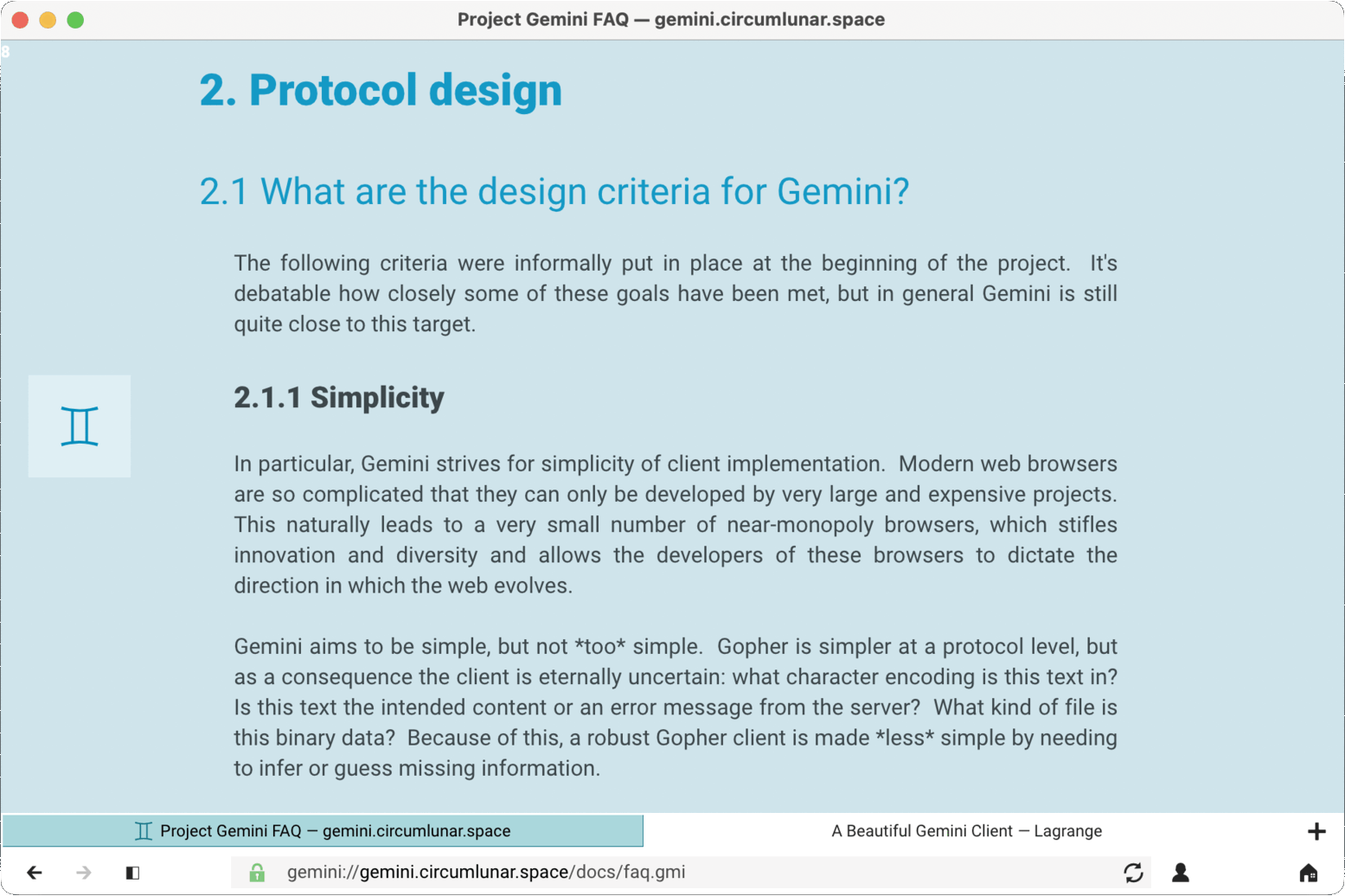
On Apple platforms, I would've already switched to SF UI but unfortunately that is only possible via a suitably advanced font renderer — it's not a simple TrueType font — which means first needing to use the Core Text API.
On Windows and macOS, a few of the TrueType fonts in system directories are now automatically made available in the app via a built-in fontpack. On macOS, this includes fonts like Avenir Next, Optima, Palatino, and Times. On Windows, I'm currently just loading Segoe UI.
UI layout options
Mobile UIs favor a low center of gravity as one's fingers can most comfortably reach the lower half of the screen. Thus it makes sense to place the most important UI elements at the bottom of the screen, like many web browsers have been doing in recent years. The following new UI layout options were added for mobile, but I like them on the desktop quite a lot, too:
- "Bottom URL Bar" moves the navigation bar to the bottom of the window.
- "Bottom Tabs" moves the tab bar to the bottom of the window.
These can be enabled separately to customize the layout to your liking.
At least for me, moving the nav bar to the bottom evokes the feel of a terminal UI where you enter commands near the bottom of the screen. I rather like this notion. When you think about it, Lagrange tends towards being a "graphical terminal UI" instead of a conventional GUI: it's heavily text-focused, can be used via the keyboard, doesn't use native UI controls for portability, and does a fair bit of terminal emulation via ANSI escape sequences.
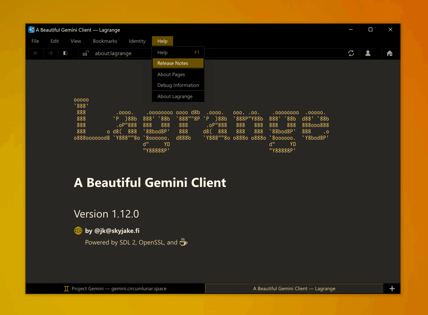
On non-Apple platforms, I've also added the option to use a normal menu bar instead of a hamburger menu, since that is more traditional for desktop apps and allows one to more easily discover all the available functions. The menu bar is enabled by default. Currently this doesn't use a native menu bar control on Windows, but that could be a nice upgrade for better accessibility; currently the menu bar is mouse-only, like all the other menus. At the moment, the conventional Alt-key shortcuts don't work with it, since those are used for opening links.
Tweaks and optimizations
- I'm a big fan of the teal/orange color combination, but using only one accent at a time makes the UI look more coherent and elegant. It also allowed me to add more options for the accent color: Red, Green, Blue, and Gray are now also available. Each of these can also be customized via the "palette.txt" file.
- Toggles use symbols instead of localized labels YES/NO.
- Input field coloring is more subtle, with reduced focus on frames as those can make the UI look more busy.
- There was a huge performance bottlenect when handling very long paragraphs in the non-native text editor. I've added a cache for recently shaped HarfBuzz buffers to ease this, which helps quite a bit, but some inefficiency still remains. The text editor needs some serious refactoring to make it more efficient with long wrapped lines.
- The number of subpixel glyph offsets is now chosen depending on the screen DPI, so you get finer offsets (four instead of two) on a normal-density display.
Oceanic
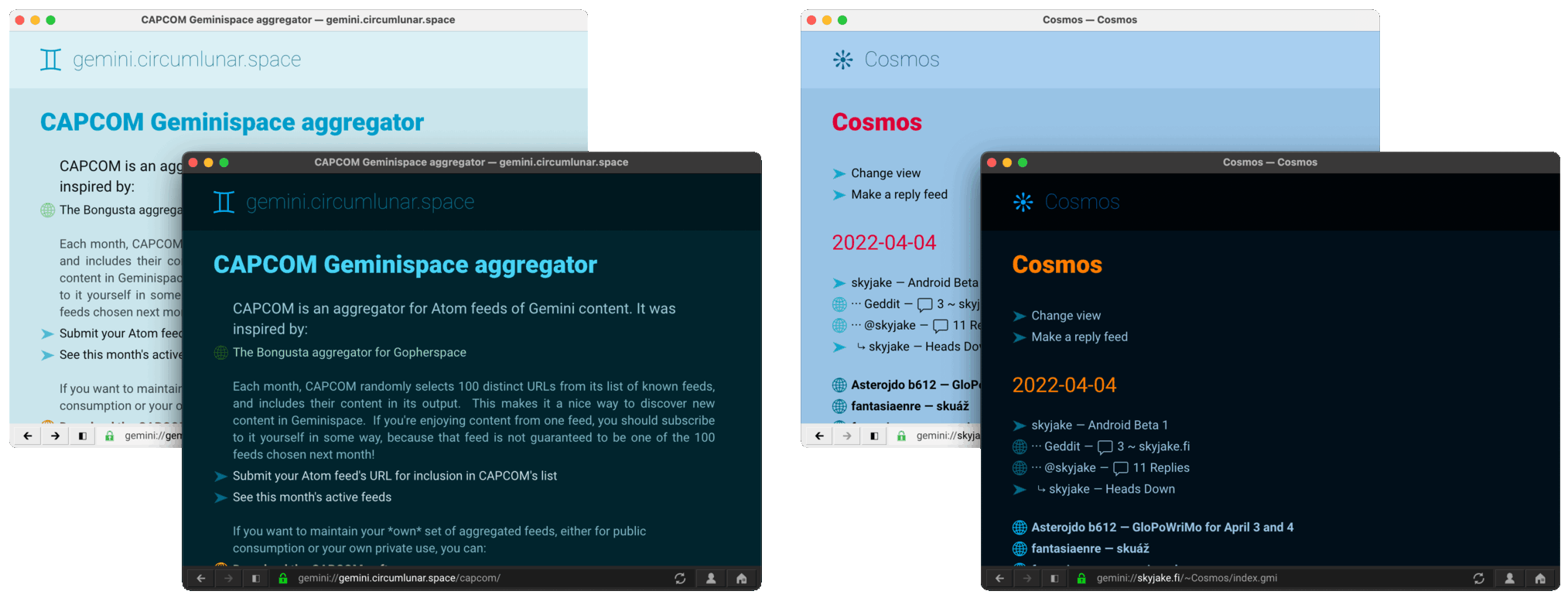
It's been a while since a new color theme was added, so I made a new one. You can now choose "Oceanic", and feel the sea breeze on your face and the sand grit underfoot.
It's a predominantly blue and teal theme with orange and red accents. The site-specific randomizer is applied to vary lightness and saturation and pick different color combinations. I want to say the results resemble different times of day of the ocean sky, and the teal variants could also be underwater...? Anyway, I've been using it a lot myself.
I spent some time tweaking the other themes, too. Notable changes are that Gopher links are now green instead of magenta, and there is a dark mode variant of Sepia. The light mode Sepia was also fine-tuned for a nicer appearance.
Justified paragraphs
One of my longer-term aspirations is to make pages appear more like traditionally typeset books. A key characteristic here is justified paragraphs. This is now available as an option under Preferences > Style, and it does make everything look visually a lot neater:
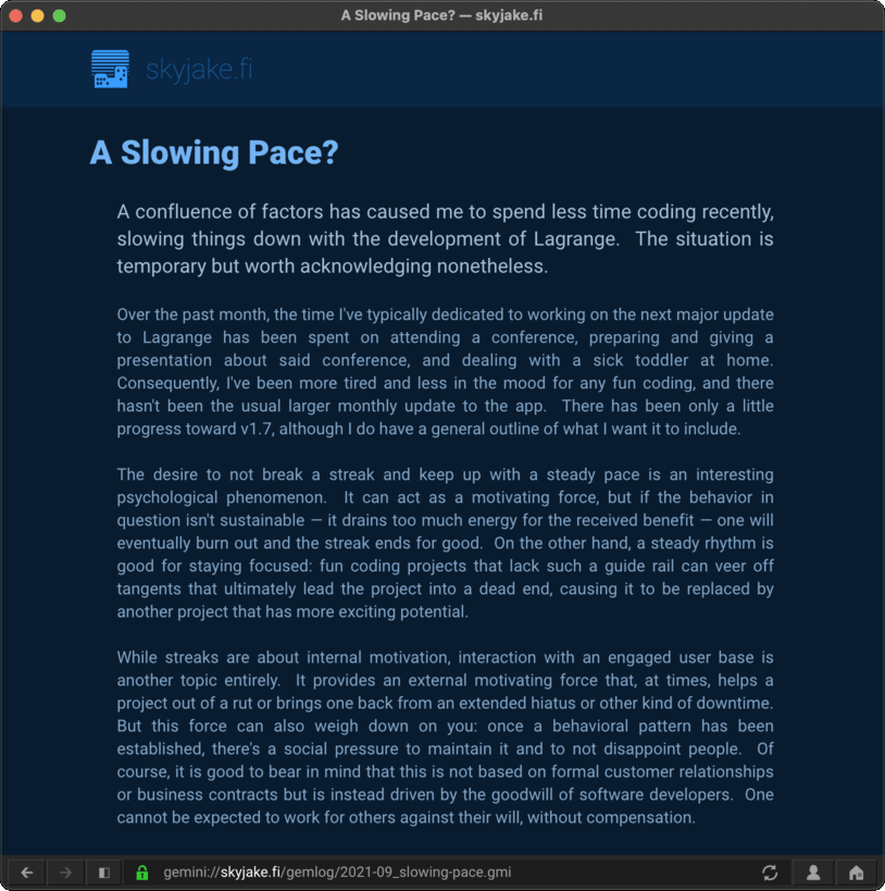
Justification is disabled by default because of a couple of downsides:
- Reduced readability due to variable-length spaces.
- No hyphenation means that there is more space to justify, sometimes inappropriately so. The situation isn't too bad for English, where words are on average pretty short, but with other languages it gets more difficult.
- It's more readable with serif fonts, I think, and the default fonts are sans-serif.
- Justification is only implemented with HarfBuzz, because it produces a glyph arrangement that can be modified as an intermediate step before rendering anything.
Implementing justification was an interesting technical challenge. In practice, once a text run has been shaped, each wrapped line is measured to see how much space is left at the end. The algorithm first tries to expand all spaces on the line, giving more weight to spaces following (what looks like) a sentence-ending period. This really only works up to a certain threshold before the line starts becoming unreadable due to large gaps, so as a final fallback an equal amount of extra space gets inserted between every character. Setting the thresholds appropriately took a few tries, and I'm sure it could still be adjusted further. With hyphenation, the thresholds could be tighter. I also tried strict caps on the thresholds, to prevent too large gaps from forming, but that produced a "half-ragged" result that was more distracting than fully ragged or fully justified. However, forcing full justification means that some lines will have silly amounts of space between characters, but that's pretty rare and in many cases could be fixed by improving the word wrapping.
Mobile
The mobile ports are progressing on a parallel track compared to the desktop build, although they are still largely aligned. Mobile improvements in v1.12 include a revised non-fullscreen design for dialogs, and a few Android integrations like native text input.
Next steps
I've already found the manual export/import very useful. In the future, it might be expanded to work with an automated sync service. I'm not sure whether I'll work on one but all the pieces seem to be in place. In any case, it would most likely be a self-hosted service, as I'm not keen on setting up a centralized server for this purpose.
It has been a couple of months of intense focus on feature work. It's probably best to let the code cool off for a while and concentrate more on polish and bug fixing, gearing things up for the bigger internal refactoring to have alternate text renderer backends. This will allow using the current renderer as a generic fallback while chosen platforms can use native text layout and rendering APIs.
📅 2022-04-05
CC-BY-SA 4.0
The original Gemtext version of this page can be accessed with a Gemini client: gemini://skyjake.fi/gemlog/2022-04_lagrange-1.12.gmi